We are proud to announce DCVMN’s rebranding!
We have transformed and redefined our logo, brand colors, and taglines. Our goal is for our rebranding to reflect all the reforms and new projects that DCVMN is undertaking.
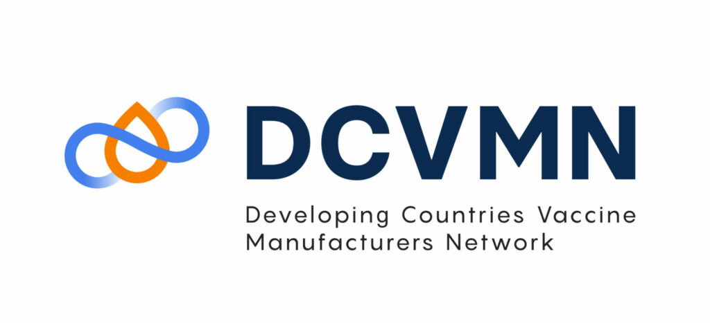
Central to our new logo is a symbolic drop, representing the vaccine—a collective pursuit within our network, striving for excellence in development, production, and widespread distribution. The infinity symbol embodies our collaborative journey, interconnectedness, and constant evolution towards novel horizons, welcoming new partnerships and members.
Each color in our new palette holds significance. Navy blue signifies our enduring trustworthiness and influence, cultivated over our 20+ years in this domain. Orange embodies flamboyance and progress, reflecting the growth of nations we engage with and our contributions to the vaccine landscape. The light blue and green symbolize communication and the new perspectives that we are ready to bring. And finally, the lilac shows our sophistication while reflecting our helpful and caring purpose.
We hope you will continue to follow us on this exciting new chapter!
Thank you Escandi Brasil for working with us on the new design and Prodigi for helping us create our rebranding video.